


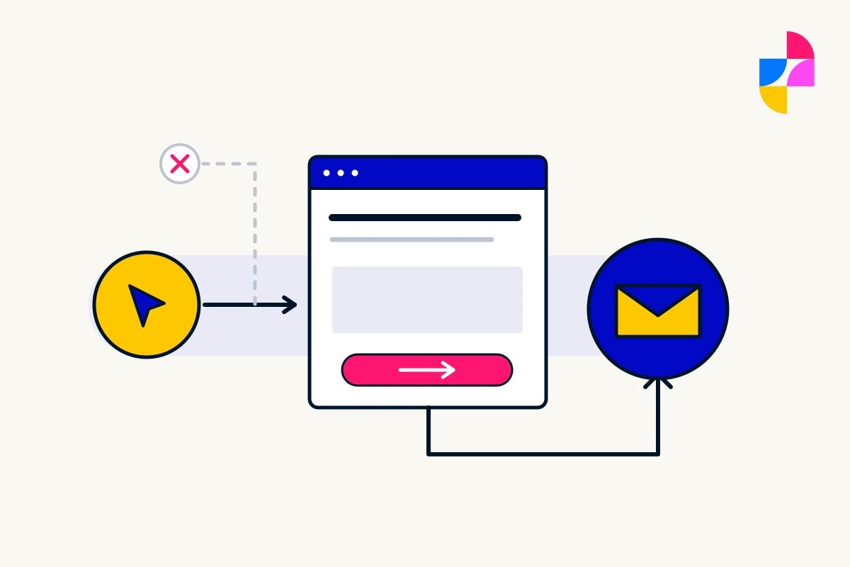
Your website gets visits, but useful inquiries are scarce. It is tempting to start with a new layout or a brighter button. First, check whether the page is reaching the right people and whether those people can take the intended next step.
A website that is not converting may have a content problem, a functional problem, an audience mismatch, or more than one issue. Low inquiry numbers alone do not tell you which one to fix.
Confirm what is actually missing
Start with the business outcome you expected and the records available to check it. Are inquiries genuinely absent, arriving somewhere unexpected, or present in the inbox but missing from a report?
Ask the person responsible for the website and inbox to test the intended route with clearly labeled test information. Our contact-form testing checklist covers the steps from opening the form to confirming receipt. A success message on the page is not enough evidence of delivery.
Resolve a confirmed break in that route before drawing conclusions about the offer. Keep real customer information out of screenshots shared for diagnosis.
Check whether visitors fit the service
Look at how people reach the relevant page, using available search or campaign information. Then compare the wording that brought them there with what the page actually offers.
In a fictional example, a business repairs commercial equipment but an old campaign describes general appliance repair. Residential visitors may reach a working page that cannot help them. Changing its colors would not resolve that mismatch. The campaign, landing-page explanation, or audience may need attention.
Do not assume every visit represents a potential buyer. If you do not have enough evidence to understand who is arriving, record that uncertainty rather than assigning the problem to the design.
Find the unanswered question before adding more persuasion
Read the page as someone deciding whether to inquire. Can they tell what work is included, whether it suits their situation, and what will happen after they contact you?
Review questions that the team answers repeatedly. A missing service-area limit, unclear process, or unexplained requirement may leave someone unsure whether the business can help.
Choose the specific answer the page needs. Our service-page structure guide shows how to organize those decisions. Avoid adding testimonials or stronger sales language as a substitute for explaining the offer.
Match the next step to what the visitor can do
A button should describe the action it actually starts. “Book an Appointment” creates a different expectation from “Ask About Availability.” If both open a general inquiry form, decide which description is accurate.
Check whether the next step demands information a first-time customer cannot reasonably provide. Ask which details the business needs now and which can be collected later. Do not remove necessary information or safeguards simply to shorten a form.
Also try the page on a phone. If the content arrives slowly or a control is difficult to use, record the exact problem. Our website speed guide explains how to investigate delays without assuming a hosting change will solve them.
Choose a fix that follows the evidence
Write down the observation, the likely explanation, the proposed change, and what you will check afterward. Label the explanation as a hypothesis until it is supported. Avoid changing the offer, content, and layout at once if that would make the outcome impossible to interpret.
Imbark’s website support is a route to discuss content corrections and unexpected behavior. If several connected parts need changing, our repair-or-redesign guide can help frame that decision. Improving a page is worthwhile; promising a particular conversion increase without evidence is not.
