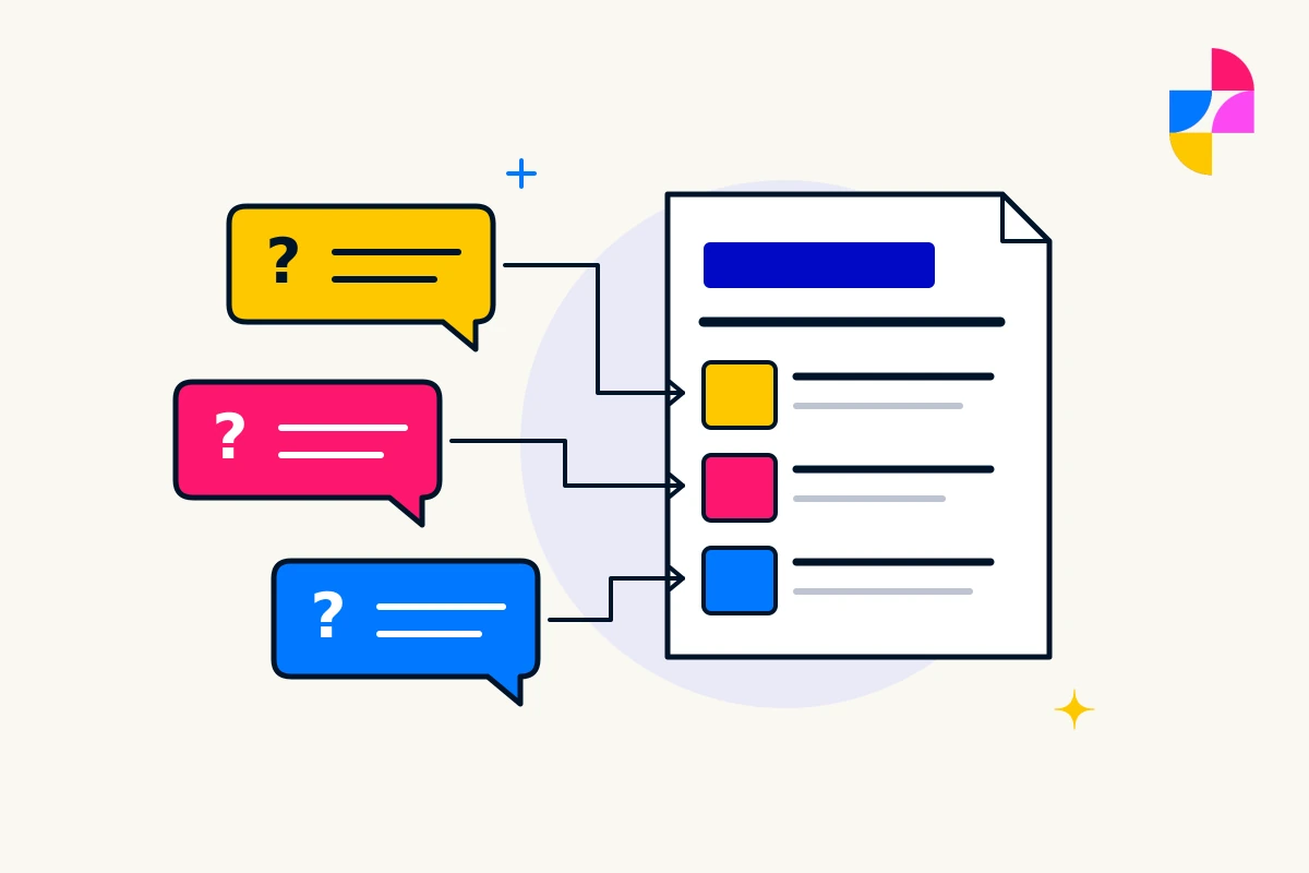
A striking website reference can make a new design idea feel essential. Before adding it to your own site, look past the screenshot. What does the effect help a customer understand, and what does it ask them to do?
Web design trends can provide useful inspiration. They are less useful as instructions. A service business needs to judge the idea with its own content, customers, and capacity to maintain it.
Turn the reference into a specific question
Describe what caught your attention. Was it a large headline, an animated project gallery, or content that changed after a selection? Then explain why it might fit your business.
“The project details are easy to compare” gives a designer something to investigate. “Make it feel like this” leaves them guessing which parts matter. Keep a simpler version available for comparison so the visual effect has to earn its place.
Motion should leave the information usable
For an animated section, ask what remains when the movement stops. Can someone still read the service explanation, understand the sequence, and reach the next step? Watch for text that appears too briefly or important details that depend on completing an elaborate scroll effect.
W3C’s guidance on animation from interactions describes ways to let people avoid nonessential interaction-triggered motion, including controls and reduced-motion preferences. Ask to review that alternative, not just the full animated presentation.
Consider a fictional renovation business comparing two project galleries. One uses a moving reveal to show the change; the other places clearly labeled before-and-after images together. Review whether each version explains the work without hiding details or requiring precise interaction.
Large type needs real content
An oversized headline can give a page character. Test it with your longest service name, an ordinary phone screen, and enlarged text. A short sample word in a design mockup does not show how a real sentence will wrap.
Look at the balance between the headline and the explanation underneath. Can visitors understand the service without scrolling through several screens of decorative wording? Check that future editors can replace the text without rebuilding the section.
The same test applies to unusual lettering and text over photographs. Review the actual words and images you will publish, including less convenient examples.
Personalization needs a dependable default
If a page changes according to a visitor’s selection or other information, decide what someone sees before making that choice. Essential service details should remain available, and visitors need a clear way to change an incorrect selection.
Ask what information the feature uses, why it needs it, and who will review the privacy arrangements. Also count the versions your team will maintain. A tailored introduction for each audience creates more copy to keep accurate.
For a small service range, a clear choice between relevant pages may do the job without an elaborate personalized experience.
Approve the effect with its upkeep attached
Before saying yes, record the idea’s purpose, the simpler alternative you compared, any usability concerns, and who can update it. Ask what happens when the animation, image, or supporting tool is unavailable. Leave unresolved questions visible rather than calling the concept finished.
Bring the reference and those questions to Imbark’s custom web design service. We can discuss how the idea fits your business, brand, and audience. For an effect already getting in the way, website support is a place to discuss a targeted correction.